


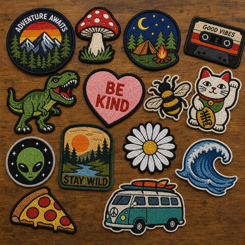
You’re handed a logo file, or you draw a design on a napkin, and you think it’s simply a matter of loading a design into a machine to make it a patch or a hoop piece. Now the first test stitch is delivered that is nothing like what you envisioned. Gradients turn muddy. When there is fine text, it folds up into a blob. Colors seamlessly merge together where they shouldn’t. When they discover that the concept of custom embroidery artwork is not the same as traditional graphic design, and that trying to apply the same approaches is exactly why it didn’t work.
Thread just doesn’t behave like ink or pixels. It has thickness, direction, physical limits a screen never shows you. Artwork that looks flawless in a design program can be genuinely impossible to stitch cleanly, and the earlier you understand that gap, the less time you burn on revisions down the line.
Here’s the path from a rough idea to a finished, stitch-ready design — what actually translates well, what doesn’t, and where most custom embroidery designs quietly fall apart before they ever reach a hoop.
Where Good Embroidery Design Ideas Actually Come From
Strong embroidery design ideas rarely arrive as a fully formed image. Usually it’s a shape, a mood, a single object someone wants represented a mascot, a monogram, a botanical motif, a brand mark that needs to read clearly at two inches wide across a shirt pocket.
The ideas that translate best into thread tend to share a few traits early on, before anyone’s even opened a design program. Clear silhouettes over busy backgrounds. Committing to a handful of colors instead of chasing every shade in a reference photo. And thinking about scale from the very first sketch, since a design built at business-card size behaves completely differently once it lands on a jacket back.
Pulling references from finished embroidery work, not just general art or photography, sets expectations that actually hold up later. A Pinterest board full of paintings won’t tell you what survives a needle passing through fabric forty thousand times; nothing in fine art has to.
Turning a Rough Idea Into Artwork for Embroidery
Once the concept settles, the next move is building real artwork for embroidery rather than jumping straight into digitizing. Vector-based artwork, done in something like Illustrator or Inkscape, gives you clean, scalable lines that hold their shape whether the final piece ends up on a two-inch patch or a full jacket back.
Raster images photos, scanned sketches need tracing or redrawing as vector shapes before they’re usable at all. Skip that step and hand a digitizer a blurry JPEG, and you’re basically asking them to guess. Guesswork shows up later as odd stitch gaps or shapes that don’t quite match what you had in your head.
- Elements That Translate Well vs Poorly Into Embroidery
- Artwork Element Translates Well Causes Problems
- Bold outlines Yes
- Solid color blocks Yes
- Fine gradients or photo shading Yes, muddies badly
- Thin lines under 1mm Yes, disappears or bunches
- Small text under 5–6mm Yes, becomes illegible
- High-contrast color pairing Yes
Color Palette Rules That Matter More in Thread Than in Print
Color behaves differently the moment it becomes thread instead of ink. A gradient that reads smooth on your monitor turns into a stepped, banded mess once a machine tries approximating it in stitches, since thread simply can’t blend the way liquid ink or digital pixels do.
Most strong custom embroidery designs land somewhere between four and seven thread colors, picked for contrast rather than subtlety. Adjacent colors need real separation so the stitching reads clearly from a few feet away, which, realistically, is the distance most embroidered pieces actually get viewed from. Nobody’s studying a cap logo six inches from their face. Matching thread colors against an actual manufacturer chart, Madeira or Isacord for instance, early in the process also saves you a frustrating round of “that’s not quite the shade I picked” once the sample lands on your desk.
From Artwork to Stitch File: The Digitizing Process
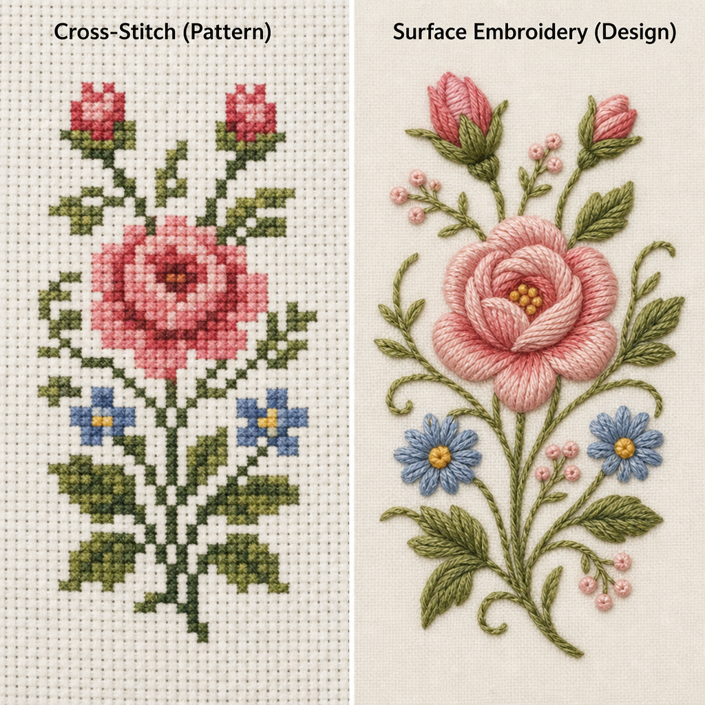
Digitizing is the step that actually turns finished artwork into something a machine can run, and it’s where digital embroidery art either holds together or falls apart entirely. A digitizer human, software-assisted, sometimes both decides stitch type, direction, and density for every section of the design, none of which exists anywhere in the original artwork file on its own.
Underlay stitches go in first, a loose foundational layer stabilizing the fabric before the visible top stitching lands on it. Stitch direction gets mapped to follow the natural flow of each shape instead of running flat in one grid, which is a big part of why a well-digitized flower petal ends up looking dimensional instead of flat and lifeless. Push and pull compensation gets built in too, correcting for how thread naturally distorts fabric mid-stitch. Skip that step, and a circle in your file can easily come out looking closer to an egg.
This is also where a design gets tested for realistic stitch counts. Beautiful artwork that takes forty-five minutes to stitch on a commercial machine isn’t wrong, exactly, but it absolutely changes the math on producing it at any real volume.
Testing Your Custom Embroidery Designs Before Final Production
Skipping a physical test stitch is one of the most expensive mistakes in this entire process, and it’s tempting to skip precisely because everything looks fine on a screen. A test stitch on the actual fabric you’re planning to use exposes density problems, color clashes, and legibility issues no amount of zooming in on a monitor is ever going to show you.
Run that test on real fabric, not a scrap of something vaguely similar; stitch behavior shifts noticeably between stable twill and something stretchy like a cotton blend. Check the back of the test piece while you’re at it. A tangled, thread-heavy back usually signals a stitch path that needs cleaning up before anything goes into full production.
Common Mistakes That Sink an Otherwise Good Design
A handful of mistakes show up again and again, even in artwork that genuinely started strong. Cramming too much detail into a small design is probably the most common one an intricate crest that looks stunning at eight inches often turns into an unreadable smudge the second it’s shrunk to fit a two-inch patch.
Ignoring fabric type during the design phase causes plenty of trouble too, since a design digitized for stable canvas can pucker badly the moment it hits something soft and stretchy like fleece. And leaning entirely on auto-digitizing software without a human review pass tends to produce results that are technically functional but visually flat. The software gets the shapes right. It just misses the subtler calls, like stitch direction, that actually give a design its texture and depth.
File Formats and Delivery: What to Send Your Digitizer or Machine
Vector files like AI, EPS, or SVG are what you hand over during the artwork stage, since they stay clean and editable through however many revision rounds you need. Once digitizing wraps up, the output becomes a machine-readable stitch file. DST is close to universal across commercial machines, PES is common for home Brother machines, and JEF pairs specifically with Janome equipment.
Always confirm which format your machine or manufacturer actually needs before finalizing anything. A mismatched file format is a completely avoidable delay, and it still trips up experienced shops more often than you’d think.
Final Thoughts
Strong custom embroidery artwork is created backwards from the fabric and thread, rather than forwards from a pretty design which can be easily seen at 100% zoom. Use simple colors, create vectors from the beginning and always test stitch physically before printing a full production. Almost all the problems addressed in this guide are discovered by this one habit, before they become a costly error.
FAQs
What is good embroidery design ideas?
A concept based on simple outlines and minimal color will work best in thread. Generally, anything with fine gradients, tiny text or heavy detail will require some amount of simplifying before it can be stitched cleanly.
s it possible to use a photo as artwork for embroidery?
Not directly but tracing or redrawing the photographs as vector shapes with simplified colours first. When you add fine shading and gradients to a photo, the same cannot be easily translated to the thread and tends to look muddy when stitched.
What digital embroidery art format should I use?
Artwork in a vector format such as AI, EPS or SVG is suitable for the artwork stage. After digitized, the stitches can be sent in various formats depending on the machine: DST is widely compatible, PES is for the home Brother machines, and JEF is for Janome computers.
What is the ideal number of colors for custom embroidery?
Most well-designed patches and pieces have four to seven colors of threads used – colors that are used to contrast, not fade. If there are too many similar hues, they can tend to merge in reality when actually sewn at an average viewing distance.
How much does custom embroidery digitizing cost?
The price varies depending on the complexity of the work, but simple logos will be cheaper than detailed logos which are in colour and may require a considerable amount of stitch-direction work. Many digitizers also offer a test stitch prior to the full production, which is a good idea since it will save you from errors.